Case study · Smartfix

A brand that grew with the business
Two chapters of one Perth trade brand: Smartfix Multi-trade & Services, then Smartfix Electrical & Air Conditioning. The logo, the mascot marks, the print, and the brand out in the real world.
Multi-trade & services
One call, every trade. A bold orange wordmark with Colin the chameleon, built to work on a dark van panel as well as a white flyer.

Primary logoFull colour, for light backgrounds.
Reversed logoFor dark backgrounds, vehicles and uniforms.




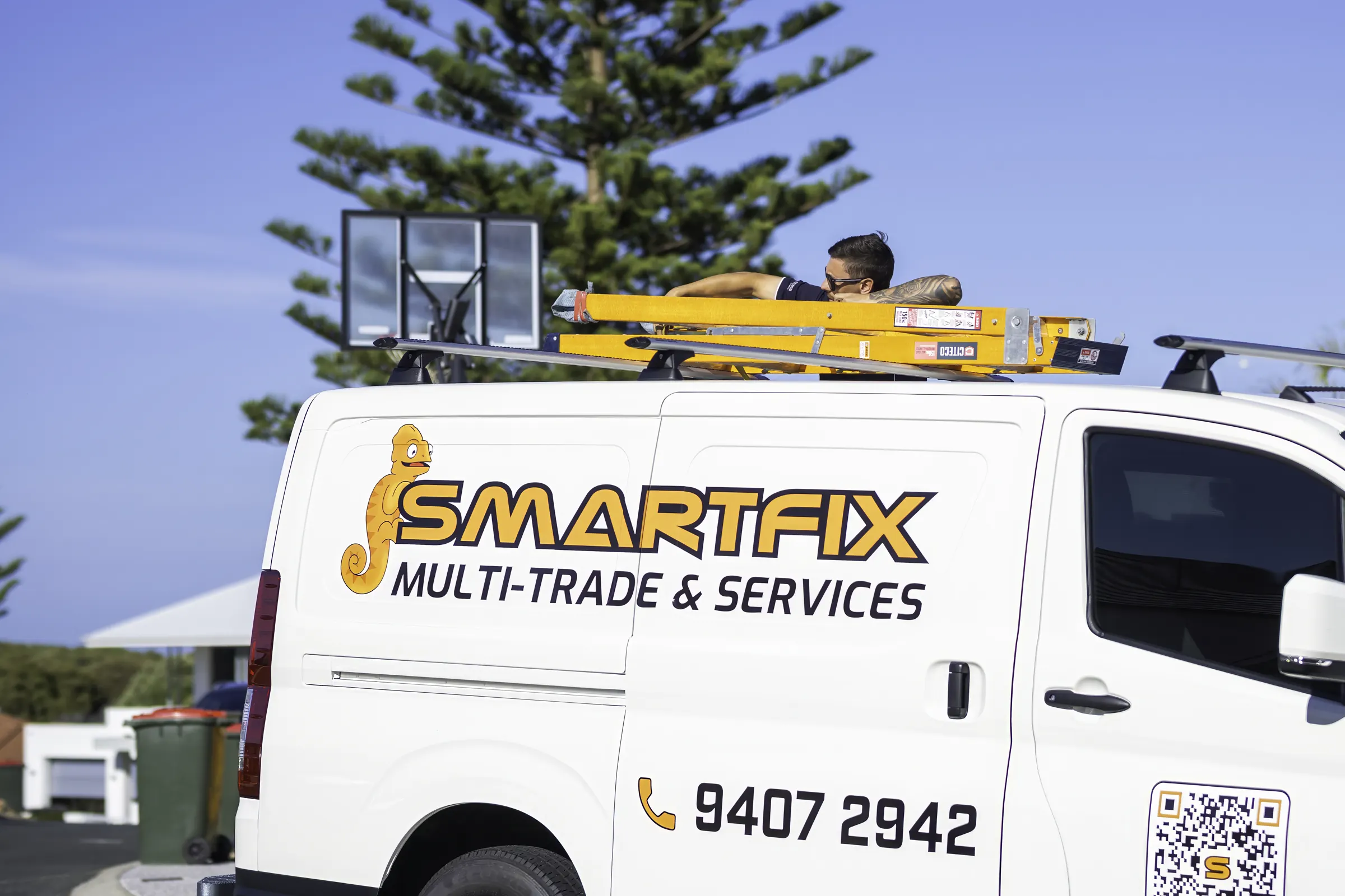
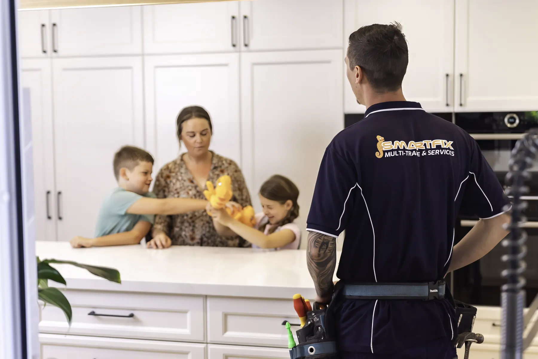
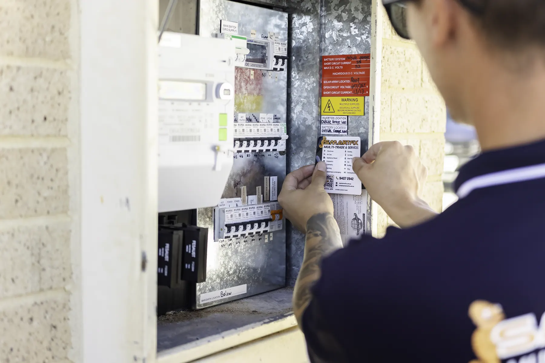
Trifold brochureLeft behind after every job: the services, why homeowners trust Smartfix, and what to look after next.
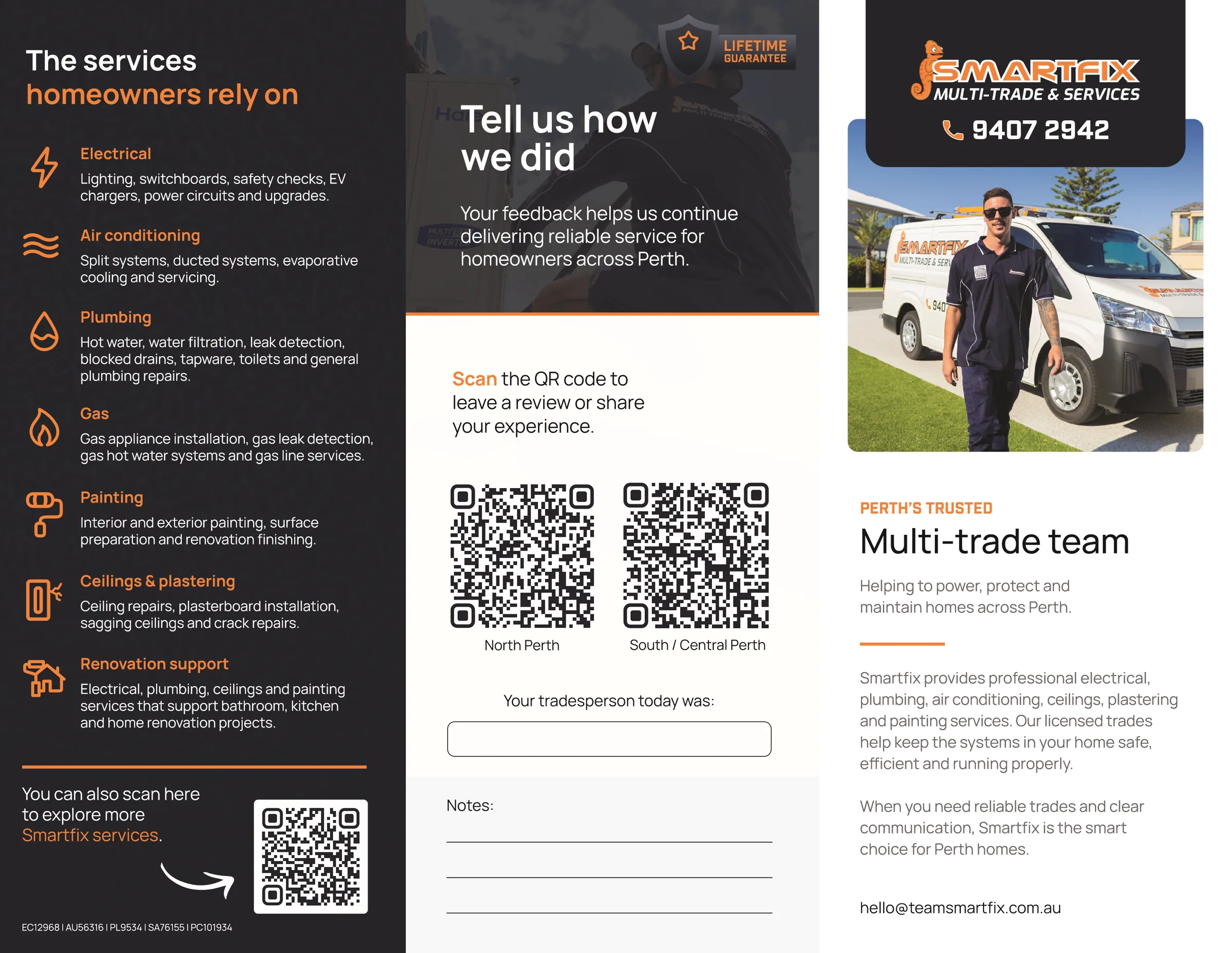
Trifold, outsideServices, a review request with a QR code for each region, and the cover.

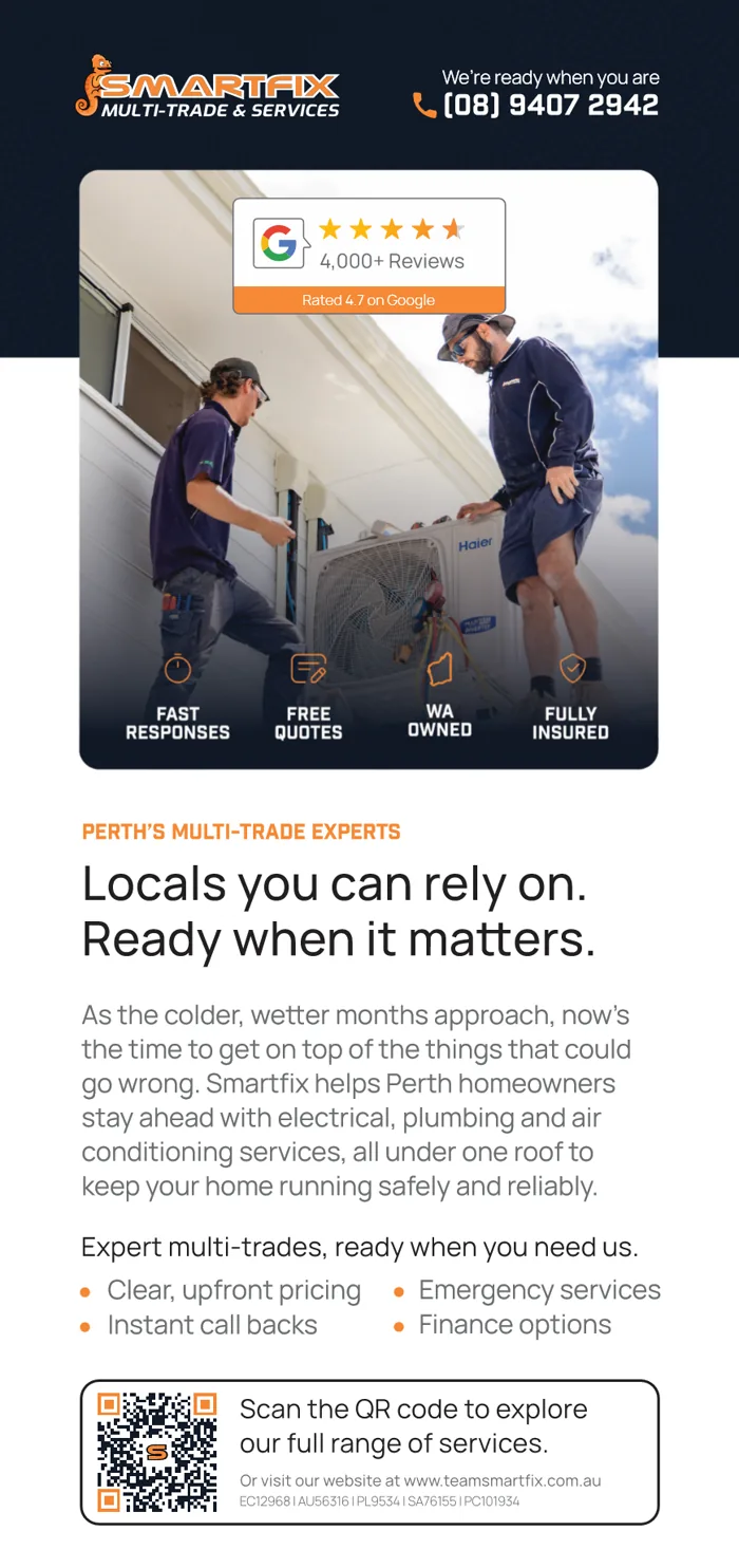

DL flyersA general flyer, a seasonal April drop and a split system offer, all from one layout system.
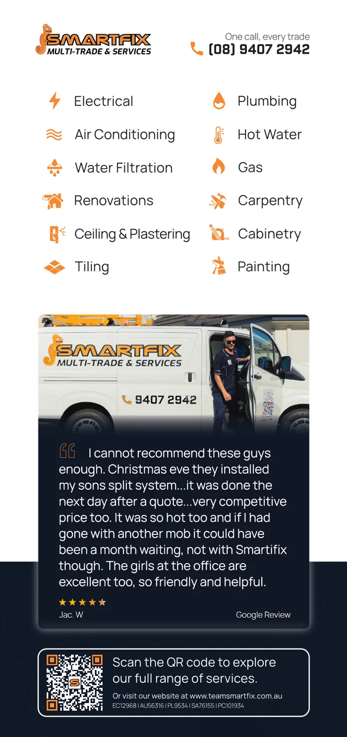
Front and backProof on the front, every trade on the back.

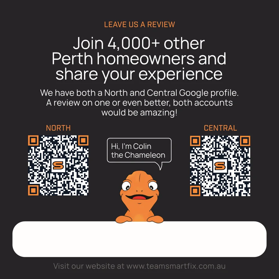
Review cardHanded over at the end of a job: every trade on one side, a review request from Colin on the other.
Electrical & air conditioning
The business narrowed its focus, and the brand followed. Same orange, same Colin, a new name line: Electrical & Air Conditioning.

Primary logoThe new name line, for light backgrounds.

Reversed logoFor dark backgrounds.


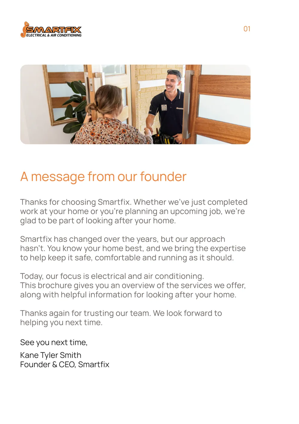
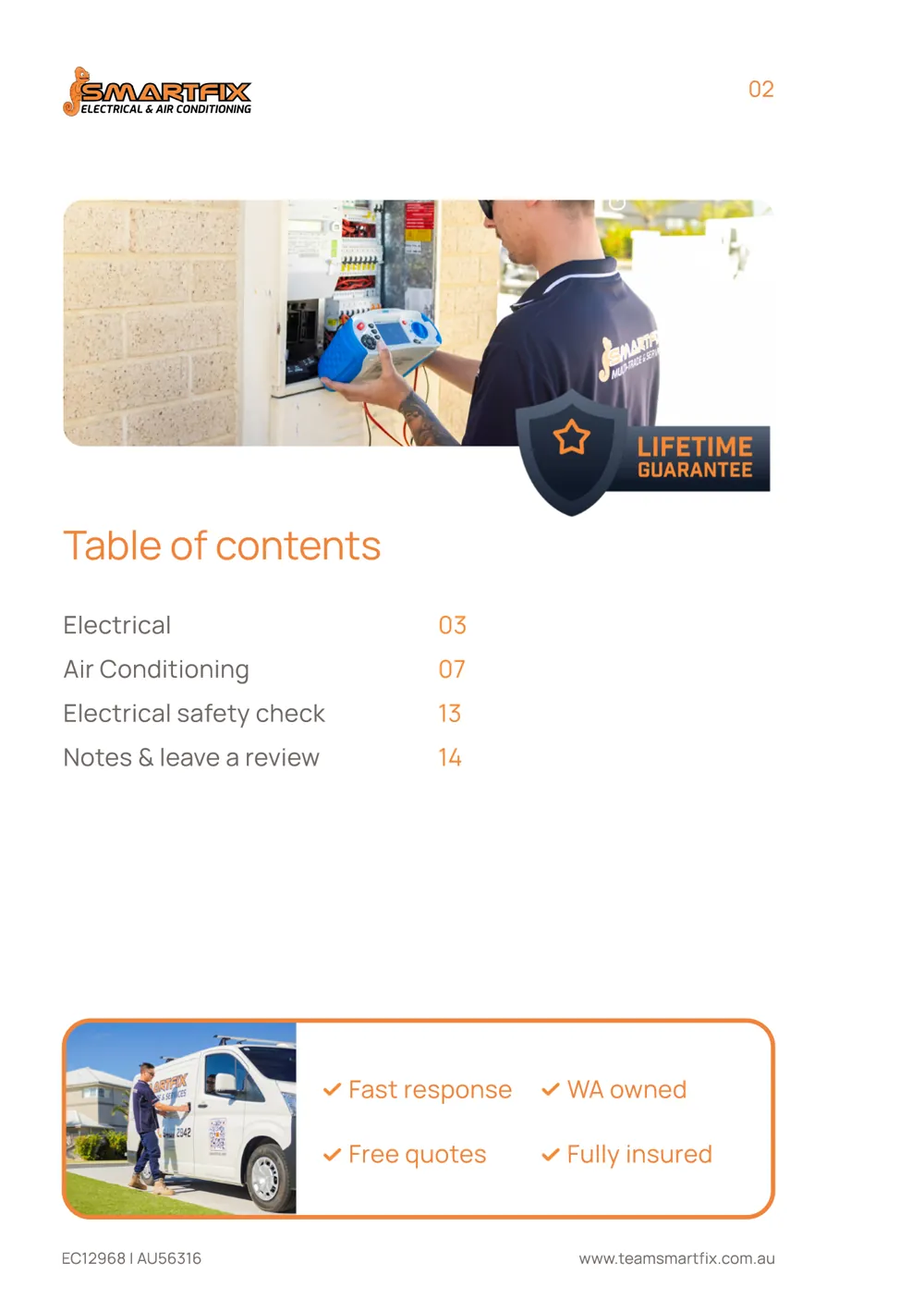
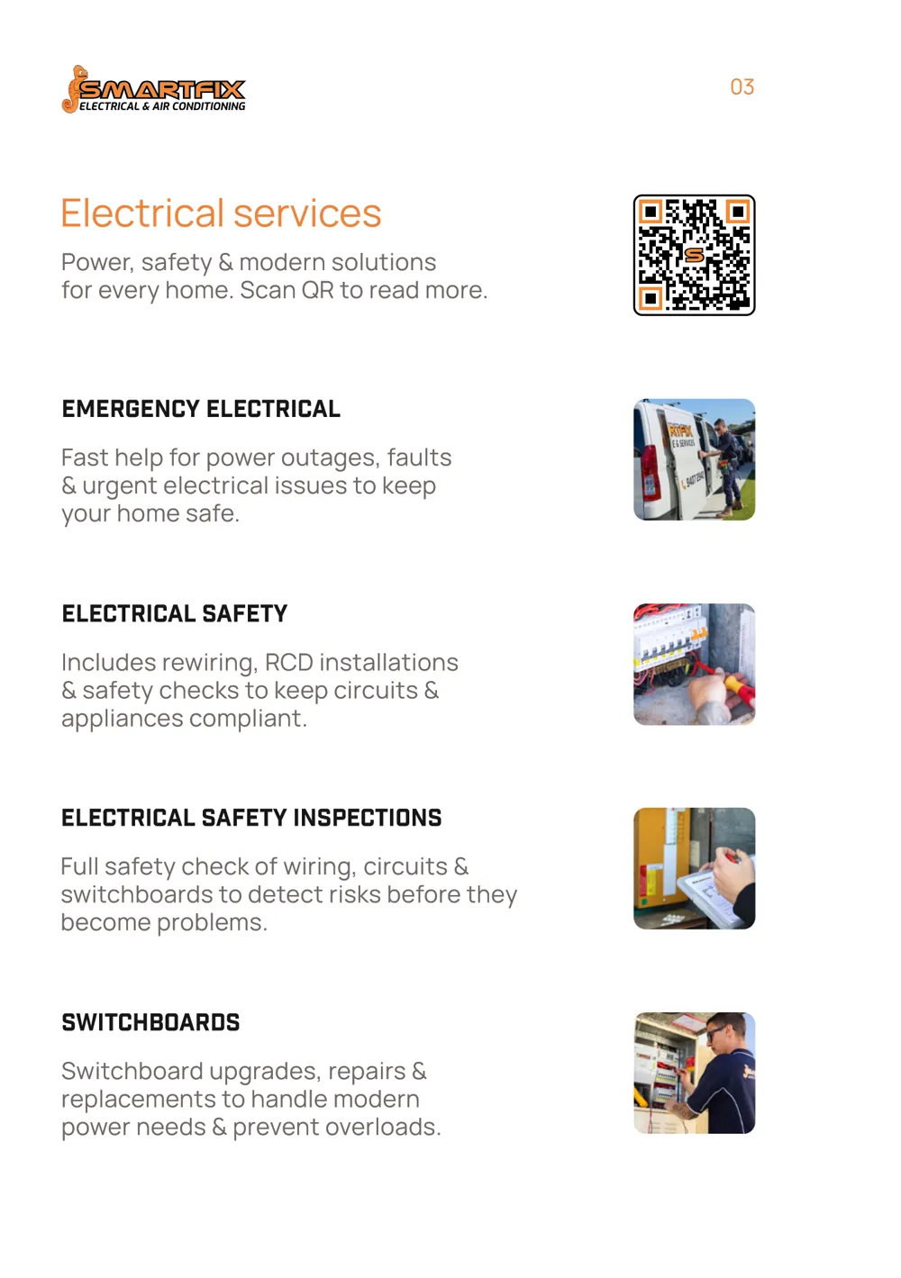
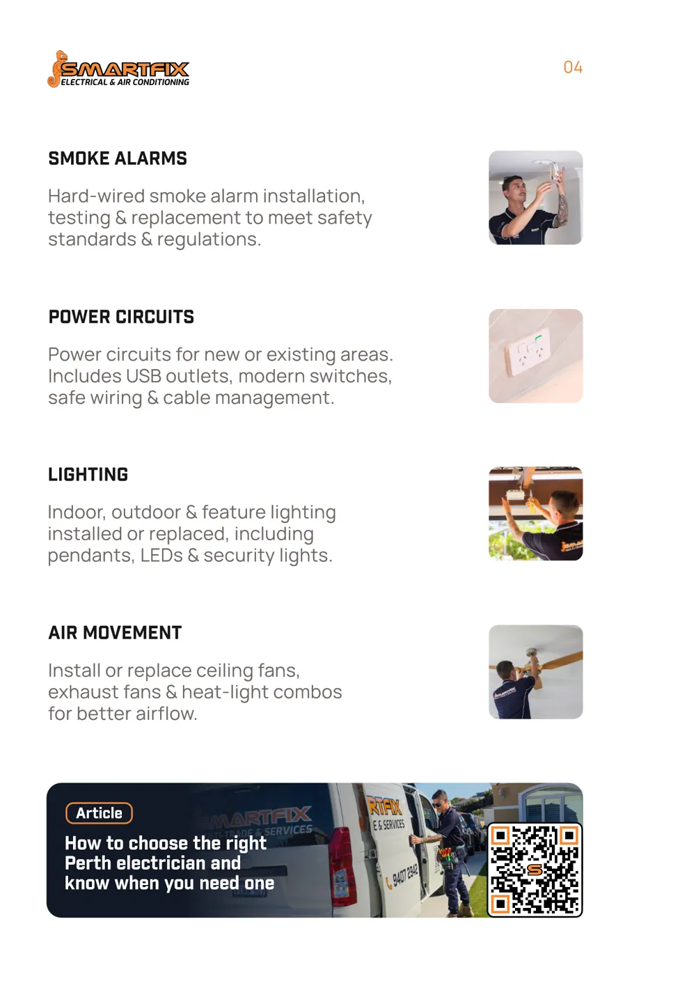
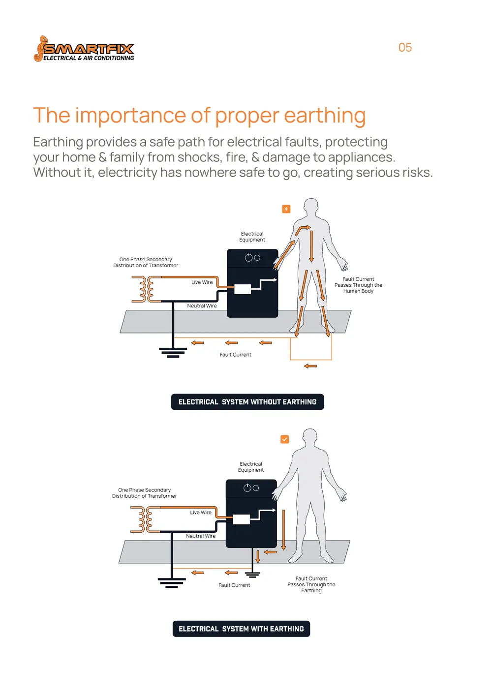
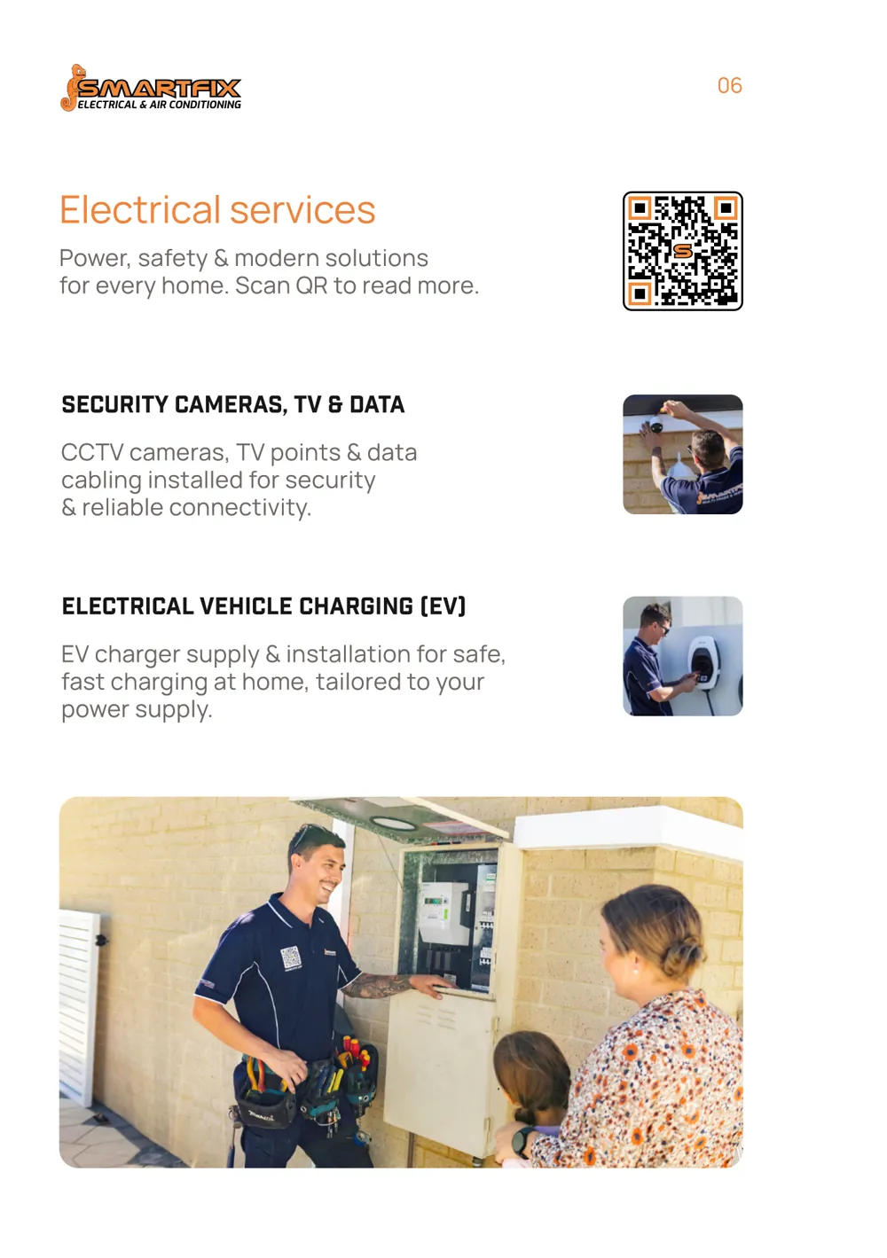
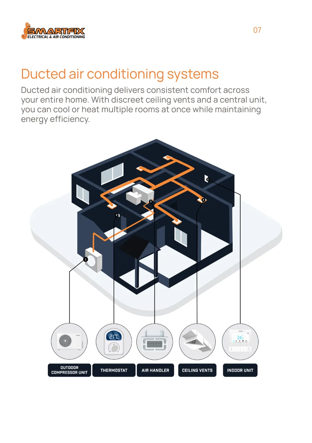
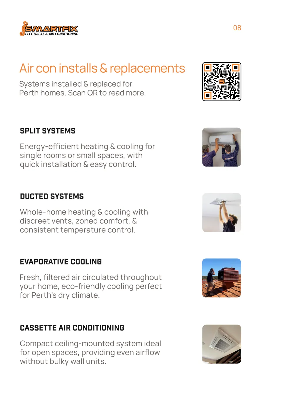
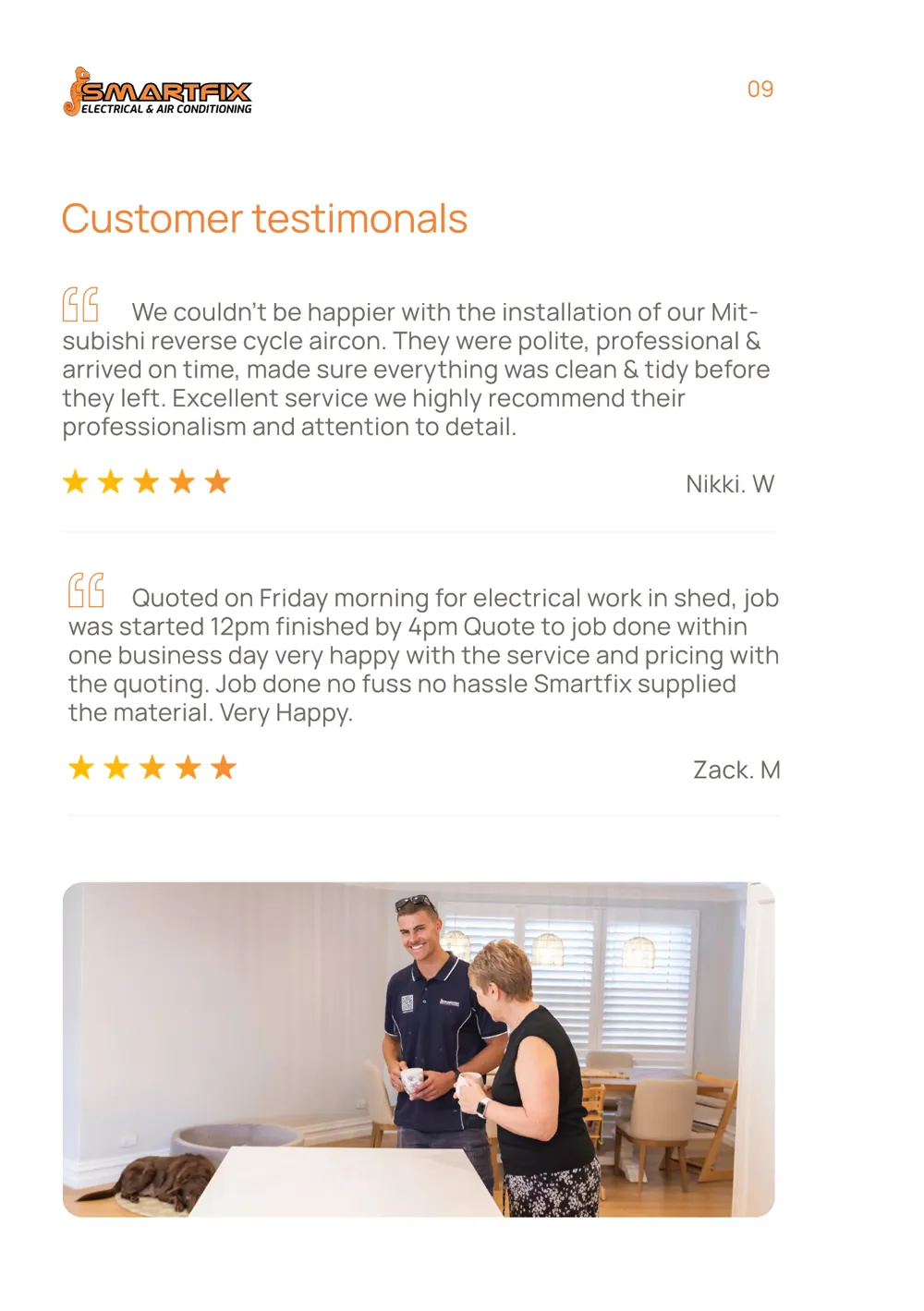
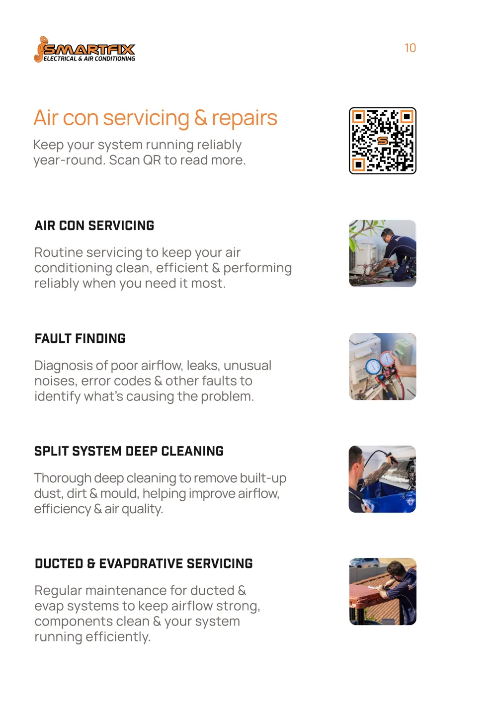
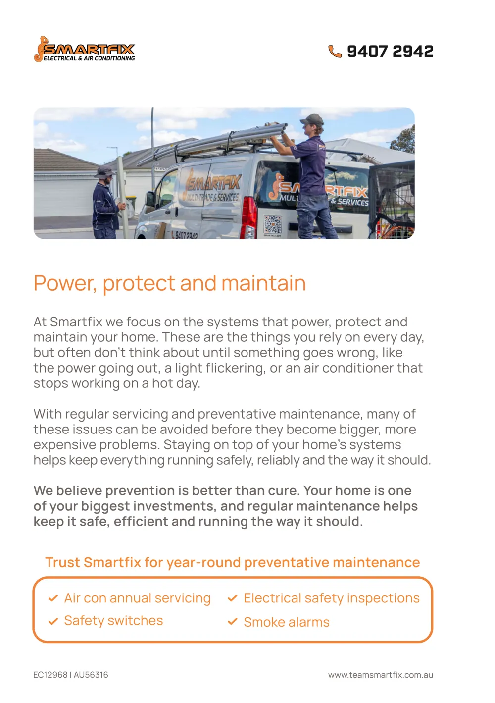
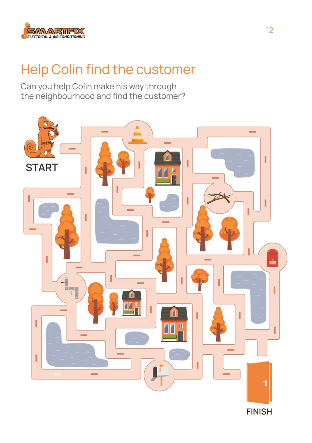
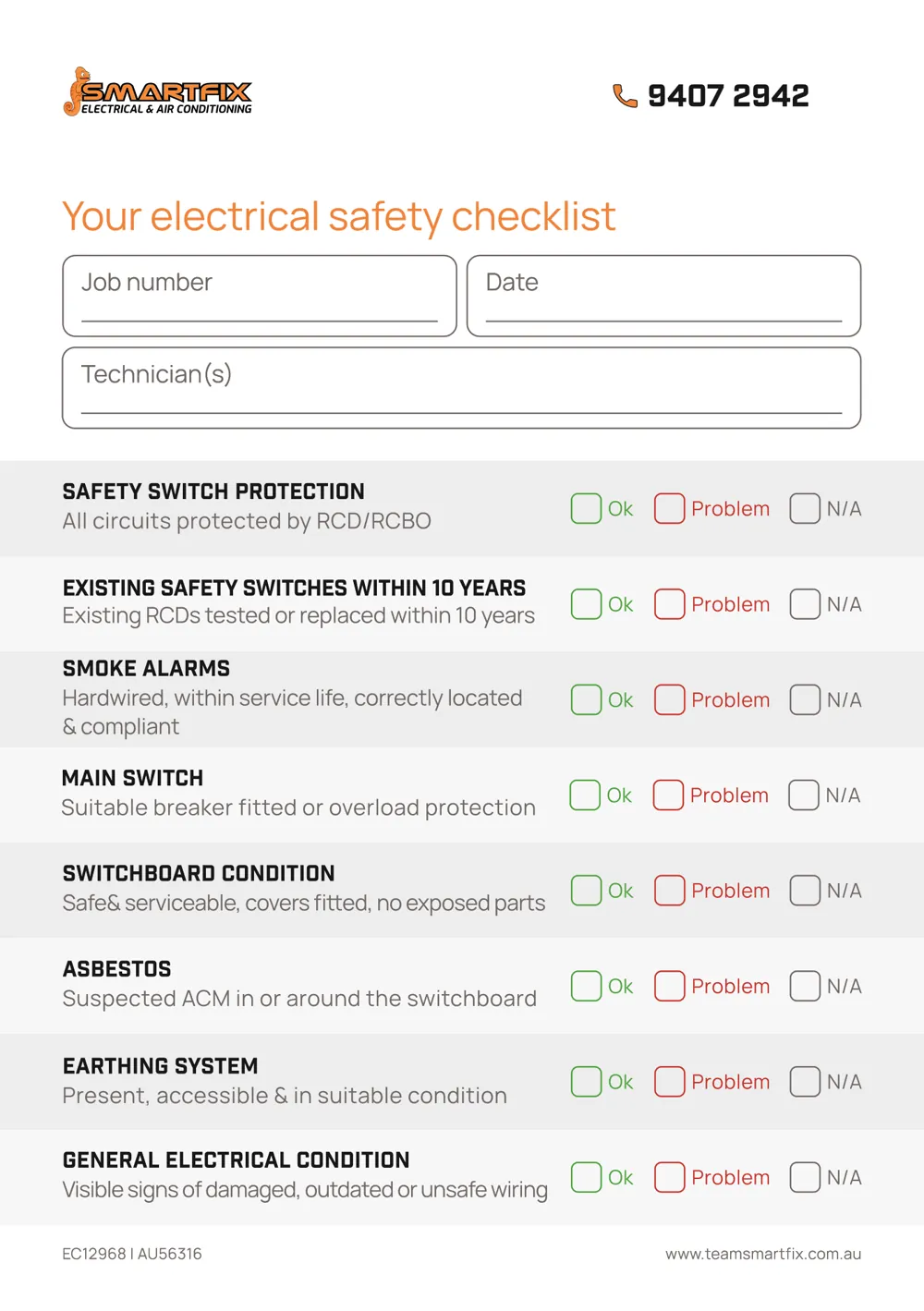
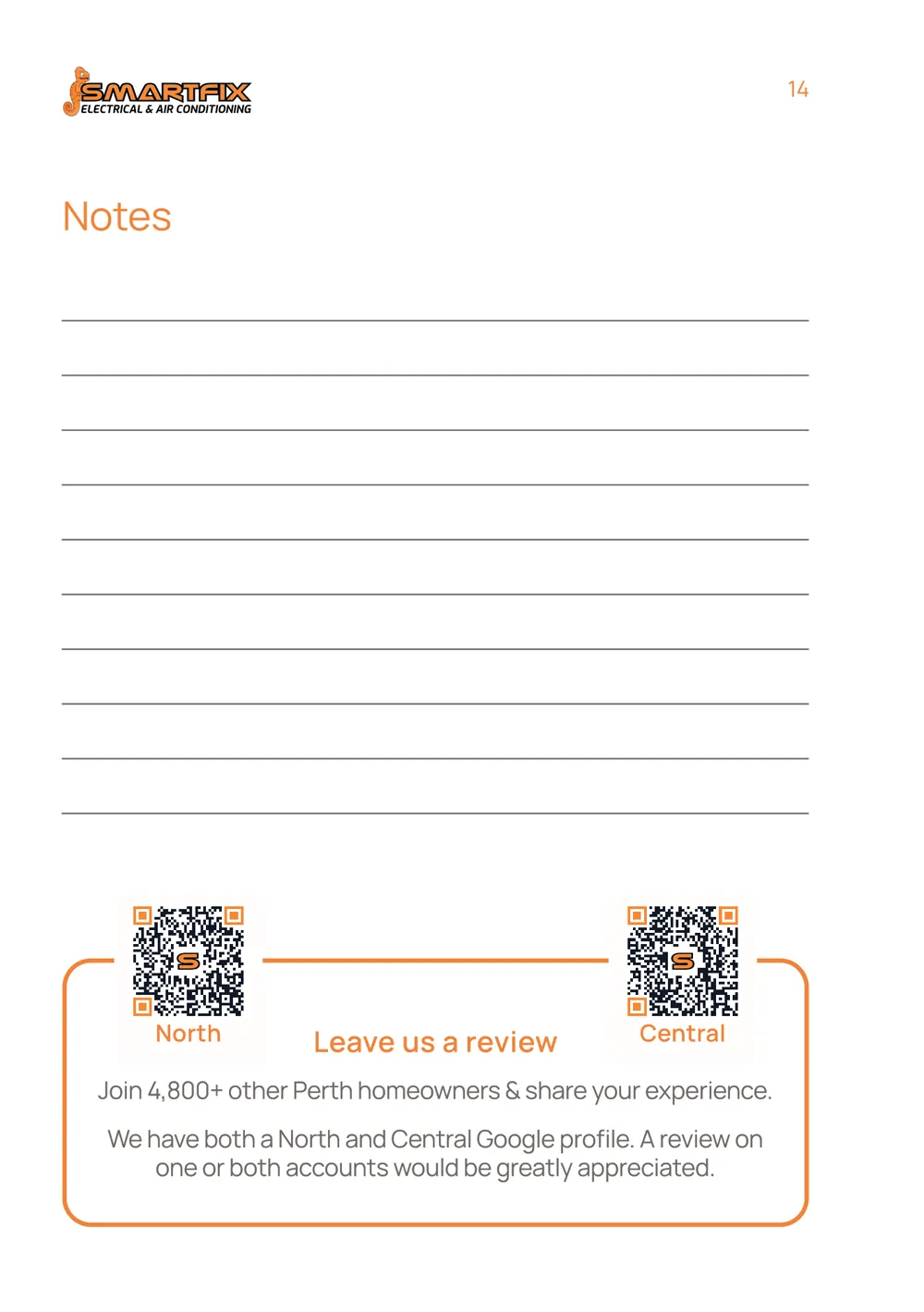
CatalogueA 16-page catalogue that stays in the home. I wrote every page of content, and illustrated the earthing diagrams and the Help Colin find the customer maze.
Flip through
Inside the catalogue
Keep scrolling to turn the pagesSwipe to turn the pages